-
Заказчик

-
Бренд

-
Исполнитель

-
Участники

-
Отрасль

-
Услуга

-
Регион

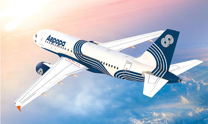
Позиционирование бренда, разработка фирменного стиля, дизайн ливреи самолетов и формы экипажа для авиакомпании "Аврора"
Vast and remote, the Russian Far East presents a great opportunity for the transportation industry. Seeking to boost travel in this underserved area, Aeroflot created Aurora Airlines, a regional carrier for the Far East. Formed from the merger of two Aeroflot subsidiaries, Vladivostok Air and SAT Airlines, Aurora offers a route map covering a territory larger than continental Europe, and is expected to serve over 2.4 million travelers by 2018. Aeroflot called on Landor to develop a brand strategy and visual identity for the new carrier.
We recommended that the brand’s messaging focus on its potential to increase mobility and prosperity in the Russian Far East. Aurora Airlines’ affordable flights promise to promote commerce and friendship in this isolated but strategically important region.
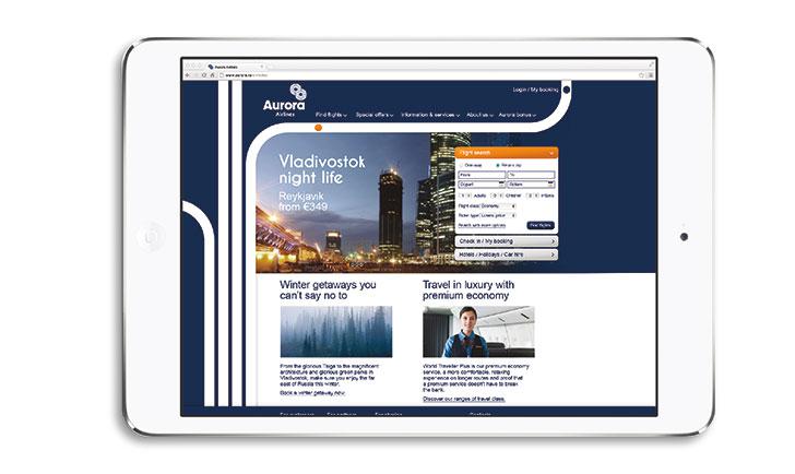
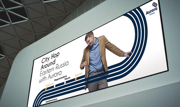
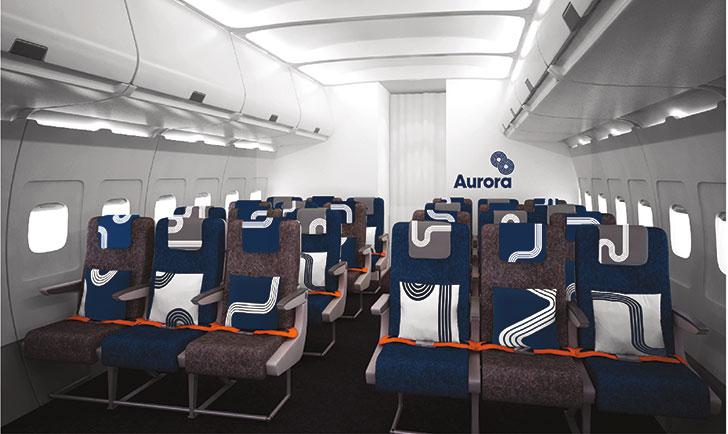
Landor’s design team drew inspiration from the multiple, fluid lines of the Russian Far East’s ancient cave paintings. We developed an identity centered on an infinity sign, a symbol of the unrestricted mobility Aurora promises the region. The visual system was applied to the livery, staff uniforms, on-board equipment, souvenirs, advertising, environments, and directional signage.
As the brand rollout continued, Landor advised the airline on an internal engagement program designed to position frontline employees as the carrier’s ambassadors. Landor’s strategy has paid off for Aeroflot and Aurora. By highlighting Aurora’s benefits to the local people, Landor has helped to make the brand easy to embrace and respect.


|
Все проекты компании |


